The simplest questions sometimes have the most complicated answers.
“Dan, can you print a family tree chart?” Fra Noi editor Paul Basile recently asked me.
“Sure, what kind of chart would you like?”
“Um, what kind do you have?”
After looking at the software I use to keep my family tree (which is Family Tree Maker) I found out just how many different kinds of charts there are. Each of them has a purpose and conveys the information in a different way. I can’t speak for the other software programs, but all of them print family tree charts. Fortunately for us, we can print many different types of charts without having to become experts at drawing boxes and moving objects around, although you can do that if you are so inclined.
Even if you use a different software program, you should be able to make most of the same charts that Family Tree Maker has. Some of the charts show boxes. Each box has a family member in it, and a line drawn between them and their parents or their children. Other types of charts contain text and almost narrate a story based on the cold hard facts you stored in each person’s record.
So let’s start with the most basic and most important chart: the Pedigree Chart. The chart looks a lot like the recent March Madness charts for NCAA basketball, or indeed any sports playoff. The Pedigree chart starts with one person, frequently yourself. It draws lines to your parents, and displays their information. Then it draws to THEIR parents and so on. So the chart gets larger with each generation. “How does it all fit on a page?” Most of the time, it doesn’t! You can change the settings for the chart to help it to fit on one or two pages. Change the number of generations to 3 or 4. You can also limit the information in each box. In the example chart, there is the dates and places of birth, marriage and death. You can make the chart smaller by removing the marriage info, for example. You can also make the font larger or smaller, but if you make it too small, you won’t be able to read the chart! The pedigree chart can be printed vertically or horizontally.
One advantage of any of these charts is that they can print on multiple pages on a normal printer, but you will have to trim the pages so they fit together to look like one big page. You can make a chart that prints beautifully on 144 pages, but if you choose to print it, you need to cut and paste all those pages together! Not a fun job, I can tell you!
The next chart is a Descendant chart. Usually you pick a great grandfather or someone further back, and it starts with a box containing him and another box with his spouse, and then boxes below him containing each of his children. Each child has his or her spouse, and below them are THEIR children etc. This kind of chart gets large very quickly when there are 120 descendants for a single ancestor. My favorite type of descendant chart includes not only genealogy data, but also photos of each person. People like to compare how everybody resembles each other.
This is a good point to detour into the subject of privacy. When you print charts to give to other people, you need to make sure you are not giving anyone private data on living people, including yourself. Once you give the chart away, you have no way to control who your cousin or friend shows it to, and the next thing you know, somebody has stolen your identity! It does happen. Each software program can mark living people as “Private” when you print the charts. The other problem, especially with descendant charts, is that sometimes people get upset when you include their ex-spouse in the family tree. They usually tolerate it when that ex-spouse is the parent of their children, but when it was a short marriage that produced no children but a lot of agita, they start asking (or demanding) that you take that person out of the tree. I don’t have the answer for how to deal with your relatives who want you to change reality for them. You just need to decide if the chart accuracy is worth more to you than your relationship with this cousin, and you’ll do the right thing.
The next chart is not always available in all genealogy software. It is the Relationship Chart. I think it’s the most useful when meeting a distant cousin and they ask “So how am I related to you?” The chart traces back your ancestry and traces back the ancestry of a second individual until you’re connected to a common ancestor. It also shows that you’re third cousins twice removed, or however you two are related.
Next is the Hourglass chart. You pick one person, usually a grandparent. The chart shows ancestors going above them, and descendants going below them. Their siblings won’t be on the chart, but it takes the same info that could be on the pedigree or the descendant chart and combines them. Of course, this can make a very large chart.
The variations are sometimes a little ridiculous. There is the Horizontal Hourglass chart, which never looks horizontal, nor like an hourglass. It is similar to the Hourglass but prints horizontally. A better chart that does the same thing is the Bow Tie chart. No this does not just print pictures of your uncle who wore a bow tie all his life! I think they all did back then! Anyway, it starts with a person and prints paternal ancestors on the left, and maternal ancestors on the right.
I just clicked “Extended Family Tree” and my computer will not let me cancel! Probably connects everyone in your family tree file — don’t ever run a chart like that unless you only have a hundred people in your file.
Moving right along, there are other charts that are called “fan charts” and they draw your tree to look like a large fan. The other charts are mostly square, but fan charts are round. You may me the person in the center, and all the charts grow around you. Looks a little like a large flower, except it has genealogy data!
I still can’t cancel that Extended chart so I have to work from memory! There are text based “reports” which use sentences to tell a very boring story using the dates and places in your file. If you want to make the story special, you need to write a few chapters of your own. They generally either go down the generations from an old ancestor (descendant report), or they work their way up the generations from yourself (known as an Ahnentafel Report). Each generation is labeled, and each member of that generation is given a number. Usually it uses the standard conventions of outlines. Roman numeral one I. Great Grandpa. Generation 2. Letter A: His oldest son, letter B his second son etc. Each person has a paragraph “Giorgio Antonio Lucente was born on 18 December 1857 in Valenzano, Bari. He died on 19 June 1872 in Valenzano, Bari.”
Each software has a way to create a custom list of fields, and generates a report. I use this a lot to check what my next research project will be. I have a saved report to tell me whose graves I haven’t yet visited at the various local cemeteries.
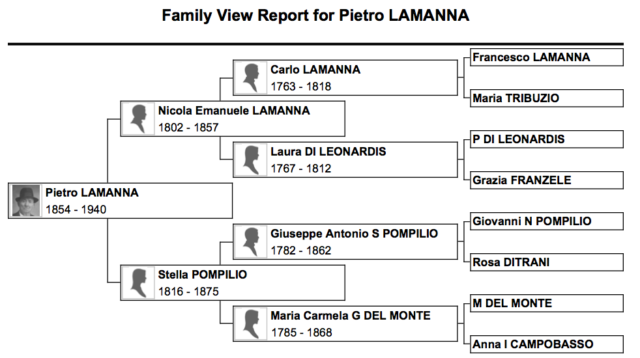
An old report that has been used forever is the Family Group Sheet. This is a very useful way to not only see which pieces of data you are missing, but also to get your relatives to fill in those blanks! It starts with the parents and all their data, and then only lists their children and their data. The focus is only on this family unit. There is also the Family View Report. As usual you pick one person, probably a grandparent. It shows a small ancestor chart at the top, and lists all his children below.
One of my personal favorites is the Outline Report. It indents each generation. Start with great-great-grandpa. Lists his first child, slightly indented. Then lists HIS children, indented a little more. Then THEIR children etc. The outline ancestor report starts with you and indents each generation going back. No boxes or lines.
My last report is necessary for me to keep track of all these people. The Calendar Report will print an actual calendar for 2017 or whatever year, and will list the people with birth dates or anniversaries on that date. Make sure to exclude deceased people or your calendar will be a mess! Also make sure everyone who is actually divorced is marked as such in your tree, or you will accidentally send out an anniversary card to a very angry cousin!
If you have any reports I didn’t list, please send me a sample at italianroots@comcast.net and let me know which software program you use.
And I think my Extended Family report finally finished!
 Fra Noi Embrace Your Inner Italian


